 Most if not all of you are familiar with User Interfaces or UI for short. Whether it be sending a text on your phone or using the ATM at the bank you have interacted with one. These are the faces of the devices and software we use on a daily basis and it takes some good design and clever thinking to make ones that work and work well.
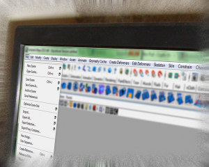
Some of my personal favorite UI’s that I think work wonderfully in design and function are for the art and design programs I use the most. Adobe Photoshop is probably one of the most intuitive programs I’ve used. The layout of the tools and accessibility makes it a very easy program to pick up and learn. For that matter I also find Autodesk’s 3D Studio Max to have a very nice user interface. Since I’ve been trained in the use of this program I have a bit of an upperhand but prior to that I had messed with it and it didn’t take me long to pick up the basic functions. That in my opinion is good UI design.
When we have a great user interface, things run smoothly and easily. But when we have a bad one… well, things get frustrating or annoying. I tried using Blender once which is an open source 3D rendering program much a kin to 3DS Max, Maya and Modo. My biggest gripe with that program? The UI was a convoluted mess to me. I didn’t think I would need to consult the online manual so much just to make a basic mesh. Unfortunately, I’ve kinda noticed this with a lot of other open source programs freely available on the web.
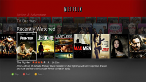
The biggest offender in my opinion? Netflix on the 360. If you have used this prior to the Kinect Dashboard Update you might remember it being kinda cool and easy to navigate. Well the new one isn’t so much hard to navigate its the way they gutted the core features.  Like… the removal of basically all other functions other then Play, Stop, Pause and Fast-foward/Rewind. There was no Skip nor were you able to restart a video without rewinding or watching all the way to the end. I mean… c’mon! Who were you thinking of when you dumbed it down so much? What made things even more annoying was now it starts everything you select automatically, this isn’t so much annoying for movies but when you want to sit down and watch a tv series you have to go in an select the episode while the currently loaded one plays. It really comes down to poor design in my opinion and I’ve had friends who have stopped watching Netflix on their 360 because of this setup.
Recently they did update the Netflix App, restoring the old 360 Media Player functions it removed. This is a step in the right direction but still I can only hope they do away with that autoplay function for TV Shows at least.
 Most if not all of you are familiar with User Interfaces or UI for short. Whether it be sending a text on your phone or using the ATM at the bank you have interacted with one. These are the faces of the devices and software we use on a daily basis and it takes some good design and clever thinking to make ones that work and work well.
Some of my personal favorite UI’s that I think work wonderfully in design and function are for the art and design programs I use the most. Adobe Photoshop is probably one of the most intuitive programs I’ve used. The layout of the tools and accessibility makes it a very easy program to pick up and learn. For that matter I also find Autodesk’s 3D Studio Max to have a very nice user interface. Since I’ve been trained in the use of this program I have a bit of an upperhand but prior to that I had messed with it and it didn’t take me long to pick up the basic functions. That in my opinion is good UI design.
When we have a great user interface, things run smoothly and easily. But when we have a bad one… well, things get frustrating or annoying. I tried using Blender once which is an open source 3D rendering program much a kin to 3DS Max, Maya and Modo. My biggest gripe with that program? The UI was a convoluted mess to me. I didn’t think I would need to consult the online manual so much just to make a basic mesh. Unfortunately, I’ve kinda noticed this with a lot of other open source programs freely available on the web.
The biggest offender in my opinion? Netflix on the 360. If you have used this prior to the Kinect Dashboard Update you might remember it being kinda cool and easy to navigate. Well the new one isn’t so much hard to navigate its the way they gutted the core features.  Like… the removal of basically all other functions other then Play, Stop, Pause and Fast-foward/Rewind. There was no Skip nor were you able to restart a video without rewinding or watching all the way to the end. I mean… c’mon! Who were you thinking of when you dumbed it down so much? What made things even more annoying was now it starts everything you select automatically, this isn’t so much annoying for movies but when you want to sit down and watch a tv series you have to go in an select the episode while the currently loaded one plays. It really comes down to poor design in my opinion and I’ve had friends who have stopped watching Netflix on their 360 because of this setup.
Recently they did update the Netflix App, restoring the old 360 Media Player functions it removed. This is a step in the right direction but still I can only hope they do away with that autoplay function for TV Shows at least.
