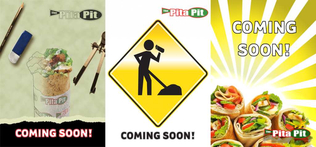
 I was asked to design some posters to announce the coming of a new Pita Pit restaurant in Elizabethtown, PA. Out of three designs I came up with, they went with the one on the far right. I preferred the one on the far left due to the symbolism of design and construction in relation to the on going construction of the restaurant location itself but my clients felt they needed something more colorful so we have the one they used. I don’t normally agree with the use of yellow in most things because of its gaudy and sometimes murky nature but it works here but in my opinion.. thats a rare thing indeed.
NOTE: These were for a local franchise and are not associated with the corporate arm of Pita Pit.
